Zero Adventure Logo Design
Designed the adventure shop logo through a creative process that began with online brainstorming and rough sketches. After exploring multiple concepts, I shortlisted the strongest ideas and finalized a bold design using a red, green, and black color palette to reflect energy, nature, and strength.
- Client: Zero Adventure
- Year: 2025
- Tools: Adobe Illustrator
- Location: Dhaka, Bangladesh
Process
Designing the logo for my adventure shop was a creative expedition in itself—one that mirrored the spirit of exploration and boldness the brand stands for. Here’s how the process unfolded:
Phase 1: Brainstorming & Inspiration
I began by immersing myself in the world of adventure branding. Through extensive web research, I explored logos from outdoor gear companies, travel brands, and expedition groups. I paid close attention to:
- Typography styles that evoke ruggedness and movement
- Symbolic elements like mountains, compasses, tents, and trails
- Color psychology in adventure branding
This helped me gather a mood board of visual references and conceptual directions.
Phase 2: Sketching & Ideation
With inspiration in hand, I moved to the sketchpad. I let ideas flow freely, sketching rough outlines of:
- Mountain peaks integrated with bold text
- Compass motifs encircling the brand name
- Minimalist tents and trail paths forming abstract shapes
Each sketch aimed to capture the essence of adventure—freedom, challenge, and nature.
Phase 3: Concept Development & Shortlisting
From the initial batch of sketches, I refined and digitized several promising concepts. I evaluated them based on:
- Visual impact and scalability
- Brand alignment and uniqueness
- Versatility across digital and print platforms
After careful consideration, I shortlisted a few standout designs that felt both bold and authentic.
Phase 4: Final Selection & Refinement
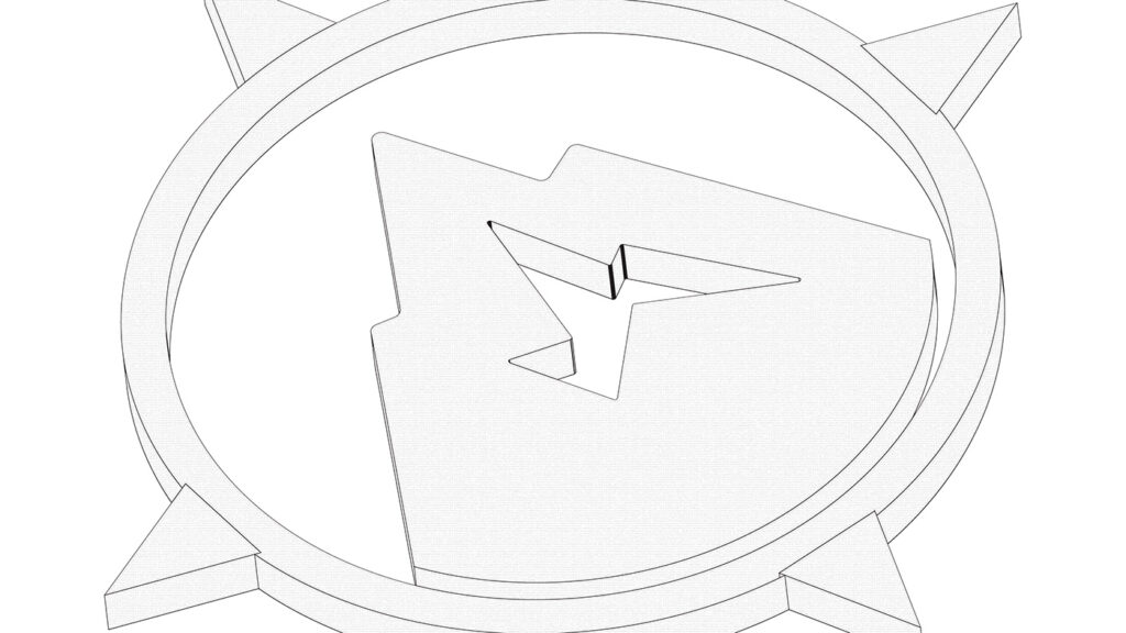
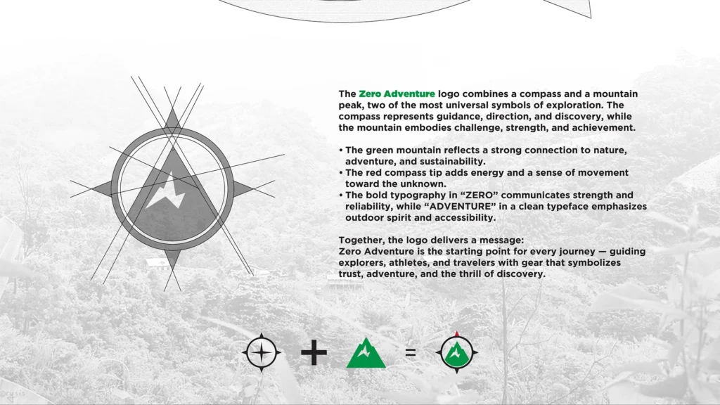
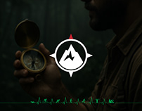
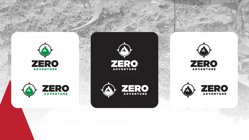
Among the shortlisted options, one design stood out—a dynamic emblem combining a stylized mountain silhouette with a compass overlay, framed by strong, modern typography. It struck the perfect balance between ruggedness and clarity.
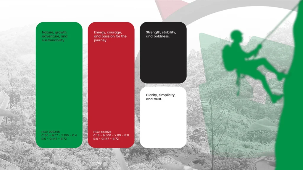
I chose a color palette of red, green, and black:
- Green for nature, growth, and outdoor exploration
- Red for energy, passion, and the thrill of adventure
- Black for strength, sophistication, and contrast
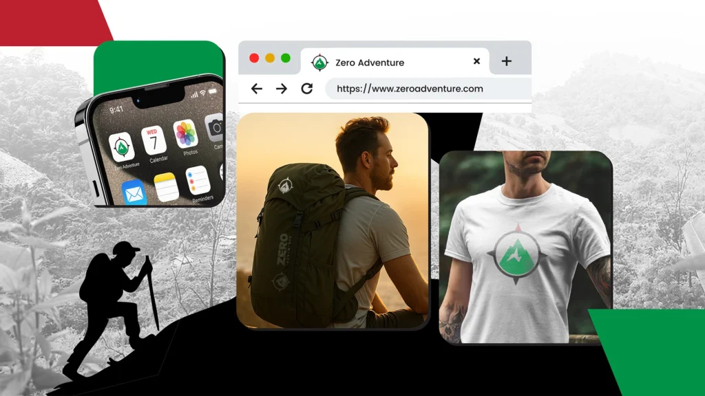
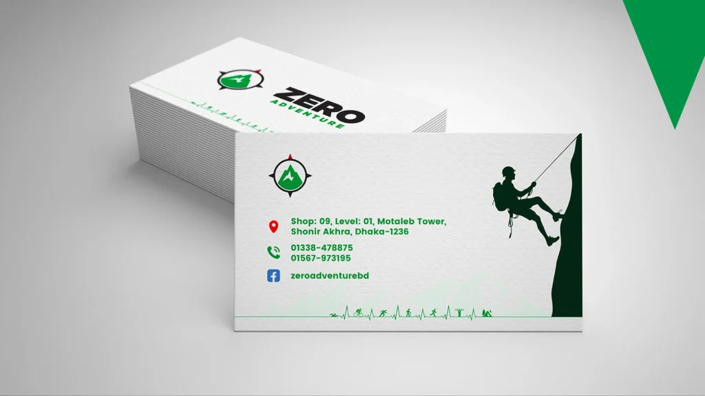
The final logo was meticulously refined for symmetry, spacing, and visual harmony—ready to represent the brand across all touchpoints.
Credits
- Design By: Saimun Nur
- Agency: Click Crafter